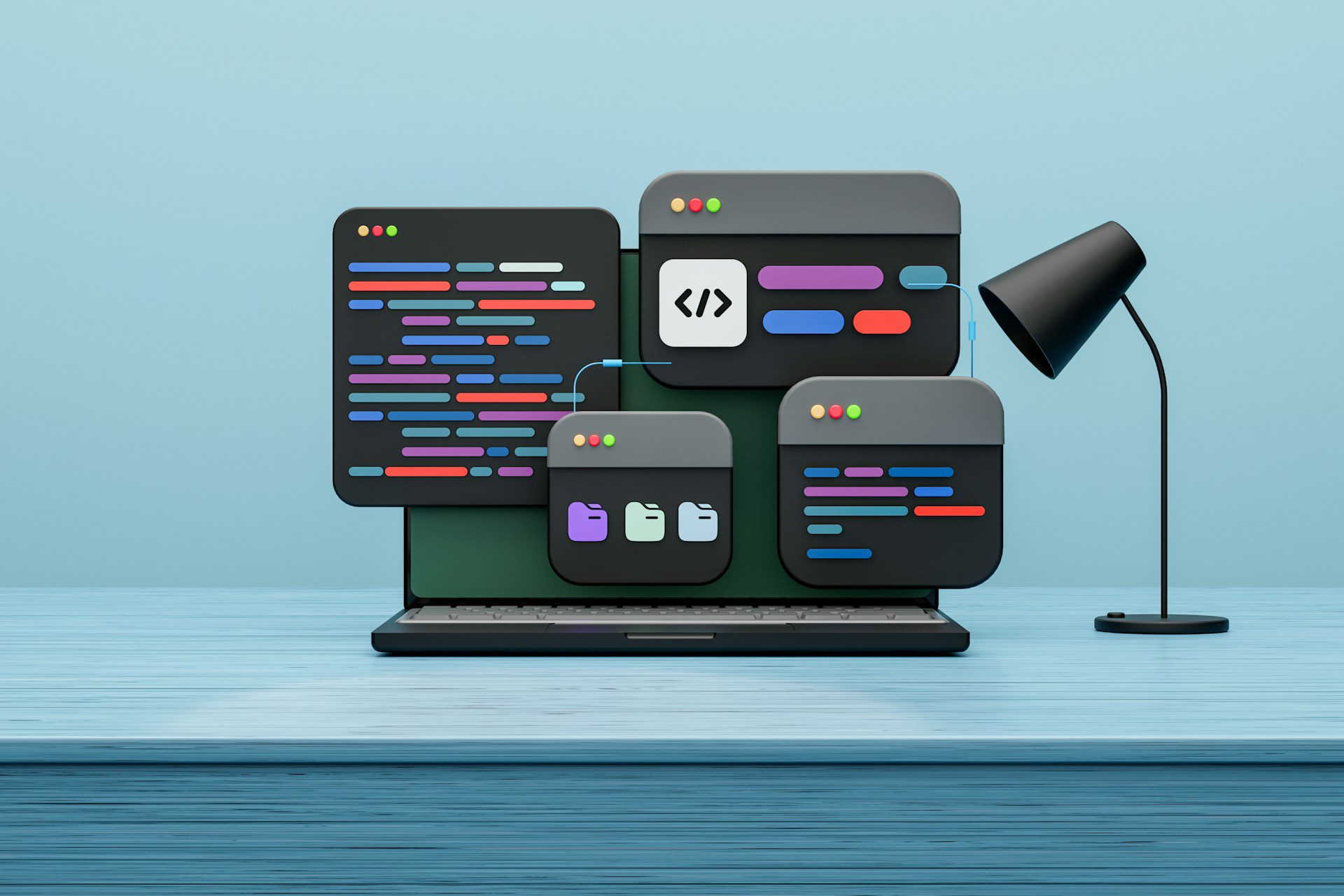
How someone experiences a website matters more now than it did just a few years ago. People expect quick loading, clean layouts, and easy-to-use menus, no matter what device they’re using. We’ve seen firsthand how design affects that experience in real time. If a visitor can’t find what they need without guessing or hunting through the page, they’re likely to give up. The way a site is built should gently guide users from one step to the next, starting with the homepage and ending with a specific action, like making a call or sending a form. That’s what responsive web design services create, a natural path that adjusts to the person using it. Layout, spacing, and structure are not just style choices. They play a clear role in whether users stick around or bounce away.
How Responsive Design Moves Users Through a Site
The biggest advantage of responsive layouts is that they clear out clutter. When a website adapts to any screen size, users don’t need to zoom or pinch to find what they’re looking for. Everything shifts into place automatically. That’s not just convenient, it keeps their attention in the right spots. We use that space to guide attention and create a rhythm that makes sense.
- Clean visual layers help people scan without getting overwhelmed
- Predictable layouts let users build a mental map of where things are
- Navigation menus stay consistent from one page to the next
From the start, we think about how someone lands on the homepage, what they should see first, and what comes next. That could be a service list, a clickable photo, or a “schedule now” button that floats where a thumb naturally falls. Those details help users move forward without hesitating. Calls-to-action should not feel forced. They should land right after someone feels ready to act, and good flow makes that timing feel natural.
The beauty of a well-planned site is that users get what they expect, right when they need it. We plan pathways so main services and important details appear where users expect them to, making the journey from start to finish feel intuitive. When each piece on the site has its own place and reason, people don’t have to think twice, navigation becomes second nature.
Common Layout Traps That Block Website Usability
When a site is packed with too much information or too many choices, it’s hard for anyone to pick a direction. Sometimes, the pages look fine on a big screen but fall apart on a phone. That’s where most layout problems start showing up. Buttons get hidden, text gets too small, and sections stack in the wrong order.
- Cluttered designs make it hard for users to focus on the next step
- Broken visuals or stretched-out images cause drop-offs, especially on mobile
- Giving users too many choices without context can create confusion
We’ve gone into websites where every service had its own bold button and none of them led anywhere helpful. That kind of thing disconnects the site’s message from the user’s goal. Visitors do not need everything all at once. They need just enough, offered at the right time.
It’s also easy for design mistakes to sneak in, such as placing key business details far down the page or repeating the same call-to-action many times in confusing ways. Those moves may seem helpful, but they often end up slowing down visitors or causing them to abandon the site altogether. Fixing flow means trimming away distractions and setting up a single, easy-to-follow track through the content.
Simple Ways Responsive Design Speeds Up Decision-Making
When a page is easy to follow, users don’t have to stop and think about how to use it. That means they spend less time trying to figure things out and more time actually reading or booking something. The path across the site feels smoother, especially for people using phones.
Mobile-first design makes a big difference because:
- Pages load faster without extra visual weight
- Sections stay in a logical order with clean scroll flow
- Buttons and forms are built for thumbs, not just clickers
We see improvements when info is layered by what people usually do first, then second, then last. Maybe they check hours, look at services, and hit the contact section last. Booking tools and quote forms should be placed where visitors naturally finish their scroll. Real-world examples include quick buttons for placing orders, signing up for newsletters, or checking out seasonal services.
When sites are arranged this way, visitors make decisions with less effort. They don’t pause to search for answers because those answers appear right when needed. Simple steps that lead smoothly from one area to the next make users more likely to reach out or follow through. A focus on useful order and clear direction keeps people from wandering off or getting stuck. Responsive design doesn’t just solve style problems; it makes the entire process feel easier and more direct for the person on the other side of the screen.
Why Poor Flow Can Hurt Local Reach in Places Like Raleigh
Even designs that look clean can still drive away visitors if the flow isn’t built around how people actually use the site. In places like Raleigh, where local browsing is common and traffic can shift with the seasons, weak flow can quiet down even the busiest times. Customers lose interest if they’re stuck on pages that load oddly or loop them around without answers.
- Bad flow tends to show up in lowered search visibility and shorter visit times
- Carolina businesses benefit from layouts that highlight location, hours, and quick actions
- Clear, easy browsing builds confidence with local customers
When we clean up structure for Carolina-based clients, the difference shows fast. People who live in nearby towns don’t want to scroll a mile to find hours or parking help. They want information they can act on quickly. Building trust means structuring content in a clear, practical way that reflects what real visitors are trying to do.
The other challenge is making sure local details, like address, directions, and unique service features, pop out early in the flow. For Raleigh businesses and their neighbors, this can mean adjusting what appears at the top for seasonal events or switching to highlight walk-in options at different times of year. Responsive design lets us shift these focus points based on what’s most useful right now. The more the layout matches how local searchers behave, the better the chance to keep them interested and reduce bounce rates.
Clear Flow Means More Action
If users feel comfortable on a site, they’re more likely to act, whether that’s filling out a form, calling a shop, or reading one more page. A strong layout quietly supports each of those steps. It doesn’t distract, confuse, or push people before they’re ready. It simply lines up the next right option and makes sure it works on every screen.
The confidence that comes from clean structure is hard to fake. Responsive design takes that pressure off users by doing the hard work behind the scenes. It lets people engage with pages naturally and gives us the room to build long-term trust, not just clicks. Small changes in layout can lead to better outcomes, and that starts with designing flow from the very beginning.
With every new site we create or update, flow and function are at the heart of every decision we make. Not only does this help visitors feel comfortable, but it also encourages them to take meaningful steps, whether that means exploring services, reaching out, or returning again in the future. A good website tells a local story through its structure, not just its words or images. By streamlining each section for clarity and predictability, we ensure visitors always know where to go next, so they feel confident moving forward.
A visually appealing site isn’t enough if visitors still feel lost or frustrated; the layout must guide them from start to finish. We build flow into every step so your audience moves seamlessly without confusion or obstacles. Our approach to responsive web design services transforms passive scrolling into meaningful action across all devices. At MRN Web Designs, we integrate performance right into your site’s structure. Let’s connect to make your next update simpler and more successful.


