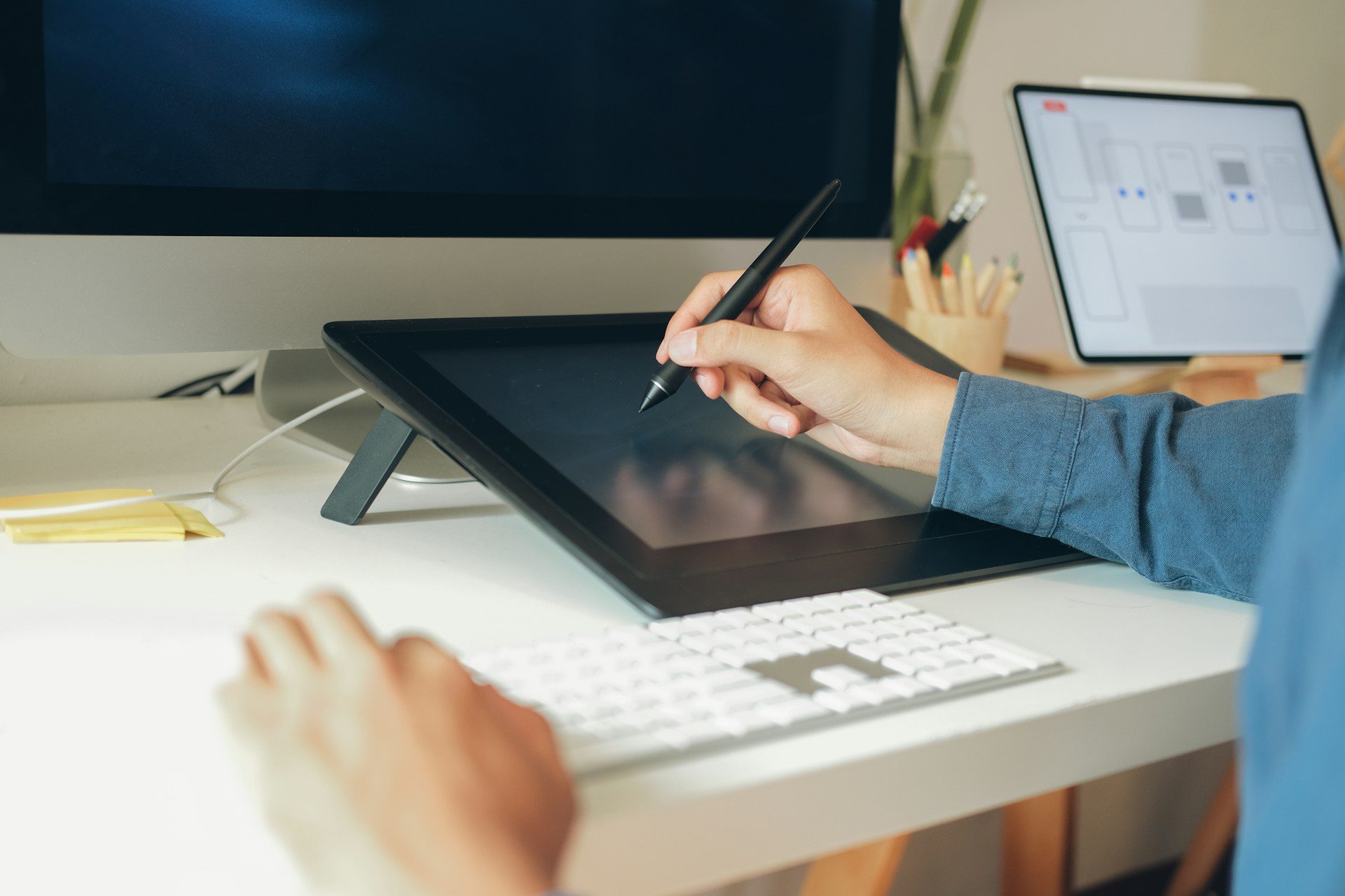
The look and feel of a website can quietly shape what people do once they land on it. Right from the layout to the way buttons are labeled, every detail plays a part in how visitors move, or don’t move, through a site. Many businesses overlook how design affects behavior, but smart changes often lead to more clicks, longer visits, and more completed actions.
We’ve seen how small adjustments, like spacing, button placement, and color, can guide someone naturally from one page to another without them even realizing it. That’s the goal of good design. When we provide website design services, we’re not just making things look nice. We’re thinking about how people interact with each part of a site and what will help them stay focused and engaged.
Thoughtful layout and design go well beyond basic visual appeal. They operate beneath the surface, quietly nudging users to notice important details, explore relevant sections, and ultimately move deeper into a site. Even subtle decisions about where elements are placed or how much white space is around them can make a big difference in whether people feel comfortable engaging or feel overwhelmed and leave quickly.
What Visitors Notice First: The Power of Visual Hierarchy
When someone lands on a webpage, their eyes don’t scan it randomly. They follow a pattern. Placement, size, and color affect what visitors see first and what they skip. That’s where visual hierarchy comes in. It’s about knowing what needs attention and guiding the visitor’s eye toward it. This ensures that the most critical content stands out immediately, setting the stage for a more productive site visit.
- Headers pull focus when they’re clear and well-spaced
- Images help break up text and keep people looking
- Whitespace gives breathing room and prevents clutter
A cluttered page makes people unsure of what to do next. A clean, balanced design simplifies their decisions and makes the site feel more trustworthy from the start.
Not only does a strong visual hierarchy help visitors find what matters most, but it also decreases the amount of effort they need to put in to achieve their goals. For instance, using larger fonts for headlines, adjusting colors for emphasis, or increasing spacing between sections can instantly boost readability and comfort. When users find it easy to spot information, they’re more likely to stay and interact with other sections of your site rather than bounce away after just a few seconds.
Navigation That Helps or Hurts
People can get frustrated quickly when they don’t know where to click. A menu bar that’s too full or hidden in an odd spot can push someone to close the tab and not come back.
Good navigation is quiet but powerful. It keeps people moving through a site without effort. That means:
- Clear labels that make sense without extra clicks
- Menu options spaced to avoid mis-clicks
- Structure that follows a natural flow, like homepage to services to contact
When things feel out of order or hard to find, users don’t just pause. They leave. Smooth navigation helps build user trust by showing that you’ve put thought into how they’ll explore your site.
Navigation also includes breadcrumbs, sidebars, and clearly marked sub-menus. Making sure that every link is easy to find and click helps users confidently move deeper into your site’s content. Providing a sense of direction, such as highlighting current pages or sections, reduces confusion and ensures a visitor doesn’t get lost partway through their journey.
Organizing navigation based on user intent also makes exploration easier. For example, grouping related pages under logical categories, or prioritizing most-searched-for services, allows guests to quickly navigate to the content they need. When navigation feels effortless, it not only increases the time spent on the site but also the likelihood that visitors will complete key actions, such as filling out a form or making a purchase.
Buttons, Colors, and Calls to Action
Design doesn’t stop at layout. It continues right to the buttons people click. Even something as basic as button color can influence what action someone takes next.
A few key points to remember here:
- Colors should stand out but not distract
- Buttons should be large enough to tap easily, especially on mobile
- Labels on buttons should be clear and action-based
When we think through these choices as part of our website design services, we focus on small things that lead to big improvements. A well-placed button with the right color contrast and spacing tells visitors exactly what step to take. It’s not about making them guess.
Consistency in button design can further boost confidence and increase conversions. For instance, utilizing an accent color for all primary actions, such as “Contact Us” or “Get Started,” makes these steps stand out without overwhelming the overall palette. Meanwhile, using a different color for secondary or less urgent actions keeps the user experience organized and intuitive.
Clarity is equally important. Labels such as “Learn More,” “Sign Up,” or “Download Guide” tell the visitor what to expect with each click. Simple button shapes, such as rounded rectangles, can make options seem more “clickable,” and proper spacing between touch targets minimizes accidental clicks, especially on smaller devices.
Mobile Visitors Use Sites Differently
More people are using phones and tablets to browse, shop, and read online. That means a site has to work well across all screen sizes. Mobile visitors tap, scroll, and pinch. They don’t use a mouse. So the design has to suit those habits.
- Buttons need to be spaced for thumbs
- Content should stack in a clear order from top to bottom
- Load time needs to be fast since mobile users are often on the move
If a design doesn’t adapt to smaller screens or feels too cramped to use, visitors won’t stick around. A mobile-friendly site isn’t just helpful, it’s expected.
Testing site layouts on a variety of devices helps ensure all visitors get an equally smooth experience. Responsive web design makes sure your navigation remains clear, text is readable without zooming, and forms or buttons are easy to interact with. Given that mobile users often multitask or move between apps, clarity and simplicity are especially vital on these screens.
Additionally, optimizing images for mobile, reducing large file sizes, and streamlining code all work together to improve load times, which further encourages visitors to stay instead of leaving out of frustration. Prioritizing mobile usability today sets your business up for future success, as even more users rely on their phones for everyday browsing and shopping.
Design Choices That Build Trust and Confidence
People decide very quickly whether a site feels trustworthy or not. And those decisions come from design.
- High-quality photos help show professionalism
- Trust symbols, like SSL badges and payment icons, offer peace of mind
- Clear formatting shows that someone has taken care in how things are presented
Low-quality images, jumbled text, or outdated graphics can drive people away before they read a single sentence. On the other hand, a polished and organized design helps visitors feel like they’re in the right place.
Attention to detail signals that you value your users’ experience. Small choices, like using a consistent color scheme or updating copyright dates and company information, also reassure visitors that the business is active and attentive. Presenting clear contact options and links to privacy policies further demonstrates transparency. These elements add up, creating a sense of reliability even before visitors interact directly with your business.
Establishing trust isn’t always about adding more content. It’s often about removing clutter and distractions. By focusing only on necessary information and relevant graphics, you give visitors a clear path forward, boosting the chance they’ll stay, return, and ultimately become loyal customers.
Why Website Design Should Always Be Intentional
Great design doesn’t just look good. It works hard in the background to guide how people behave on a site. Every detail, from the size of a headline to where a menu sits, matters. A well-designed site makes it easier for visitors to understand what you offer, where to go next, and when to take action.
We approach every project with that in mind. Thoughtful design leads to better user experiences and better results. Instead of throwing up pages and hoping for the best, we give every choice real purpose. Because what feels like a small design decision could be the reason someone stays, or leaves.
Clear, thoughtful design should shape every part of how your site feels and functions. At MRN Web Designs, we build each layout and graphic choice around what real people need when they land on your pages. For a smart, user-focused approach, our website design services help guide your visitors toward action while building trust and capturing attention. Reach out when you’re ready to start.


